Why I made it

I was browsing youtube for a time, as you do, when I got reccomended the below video. So naturally, I thought I could try my hand at making my own 4 segment display, because the one in the video kind of sucked. Afterwards, I shared my attempt on discord and my friend Sophie (Durham Maths) built on the design/revamped it. We continued to work on it and out came the above display you see (designed on Piskel).
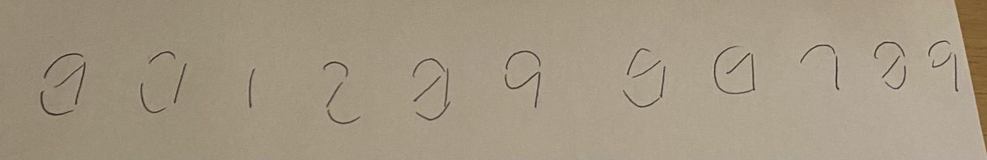
The First Draft
This design is clearly flawed. In fact even I personally cannot say with absolute certainty which number is which.
Sophie's Improvements
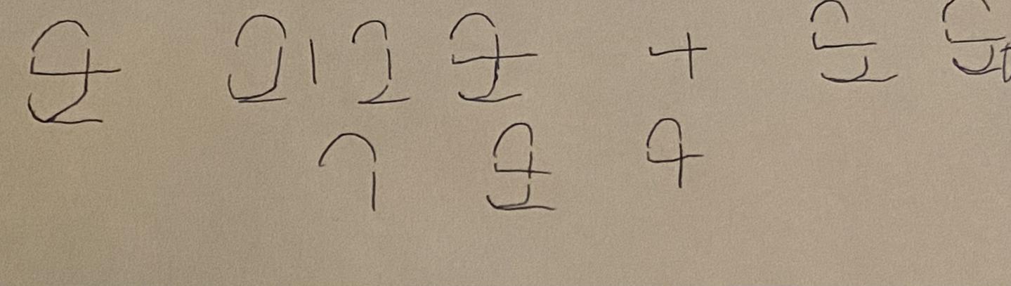
Sophie, a friend from Durham, took my design, and as the Doctor would put it, "had it torn up, thrown in the air and snogged to death". She then proceeded to make it better starting with a shot-in-the-dark attempt at a draft below:
The problem with this design, of course, was that 3,5,6 and 8 were all identical; i.e the same segments would be lit up for all of them. Instead, she changed the design completely by overlaying the numbers on top of each other to find a result:
However this design too, was flawed, and for the same reason; 8 and 3 matched and 5 and 6 matched. The final design mixed both approaches, noting that the 0 doesn't have to be complete, and came out as below:
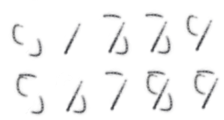
This reduced the duplicates down to 1 pair, 2 and 3. And importantly it became the basis of the final version.
Final version
Above is Sophie's final version. From her version, I fixed the issue between 2 and 3 by creating a notch for the centre spoke of the number 3, omitting the need for the central line:
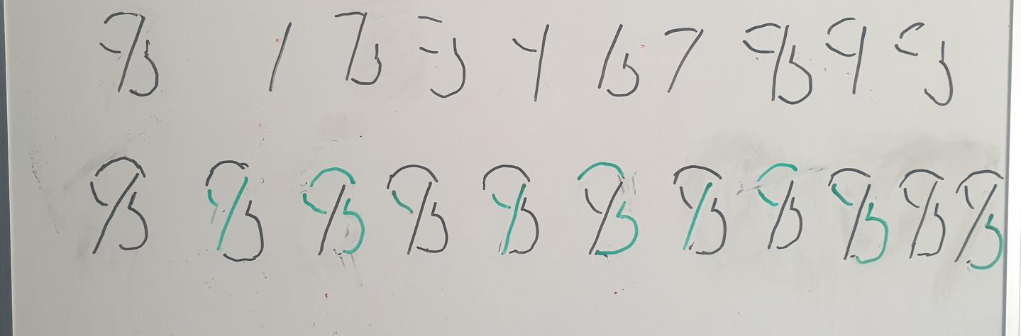
From there the design remained mostly unchanged when I digitalised it in Piskel:
One
This is fairly simple; not particularly a problem to realise this is a '1'.

Two
This is perhaps the least accurate of the digits, because the notch is meant to be percieved as disjoint from the central diagonal.


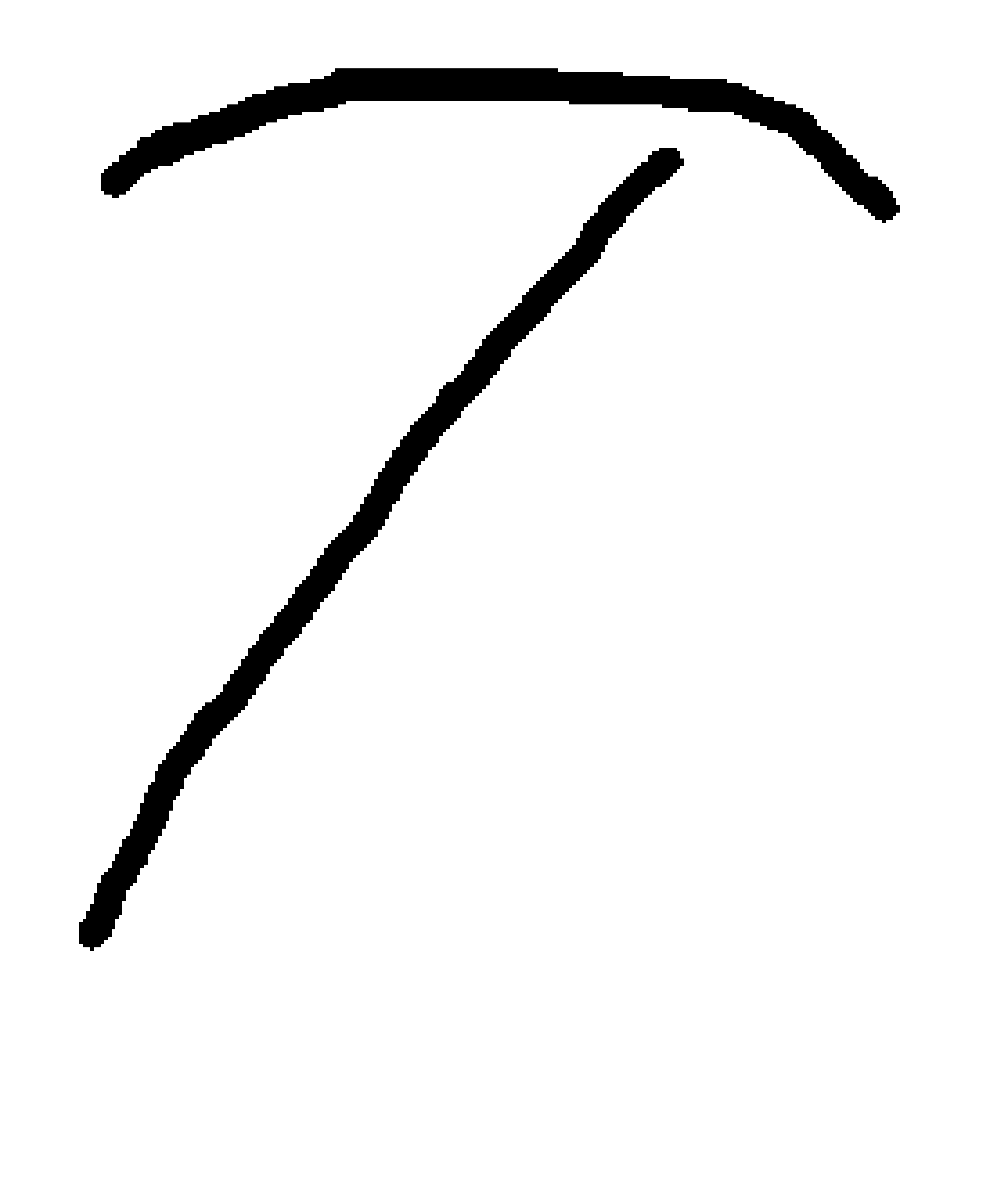
Four
This looks good enough to be a 4; note that it doesn't have to look like a 4, but moreso a 4 than any other digit.

Five
The 5, much like the two, relied on the notch being ignored, and linked to the stroke on the left; however, this worked much better

Six
The 6 requires that the notch be ignored too, however, it isn't as large a detrimant if it isn't.

Seven
As with the 1, the 7 doesn't need much explanation; it just works.
Eight
The eight works pretty well here; as you are more inclined to attach everything if there are no strokes unactive.

Nine
This is perhaps one of the most neat; likely as it doesn't involve the notch.

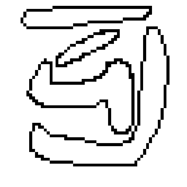
Zero
Shy of the 2, 0 is hardest to imagine because it heavily relies on the illusory contouring. Even moreso because the missing part on the 0 on the top is a segment, but activating it causes conflict with the 5.